When using the keyboard, 6 actions can be performed: Press (touching and releasing the button before the time has elapsed from which the touch is judged to hold, this time can be set in the design), Hold (touch and hold the key until swipe up (touch and swipe directly up (at least the height of the key)), swipe right (touch and swipe right (at least the button width)), swipe down (touch and swipe down (at least the height of the key)), swipe left (touch and swipe left (at least the button width)).
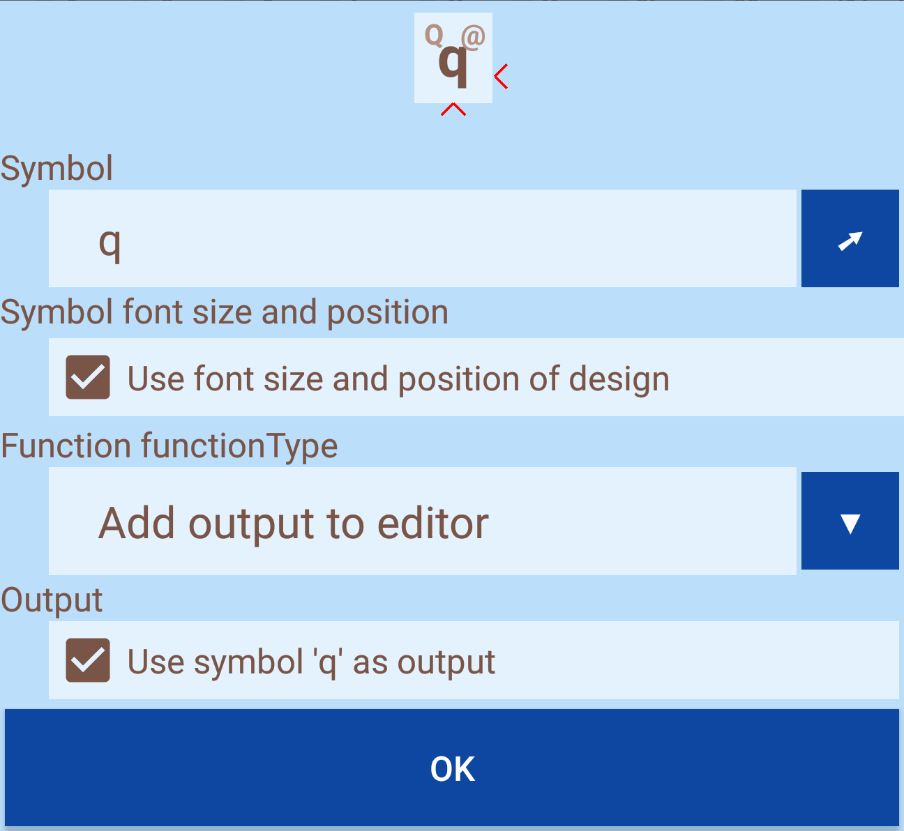
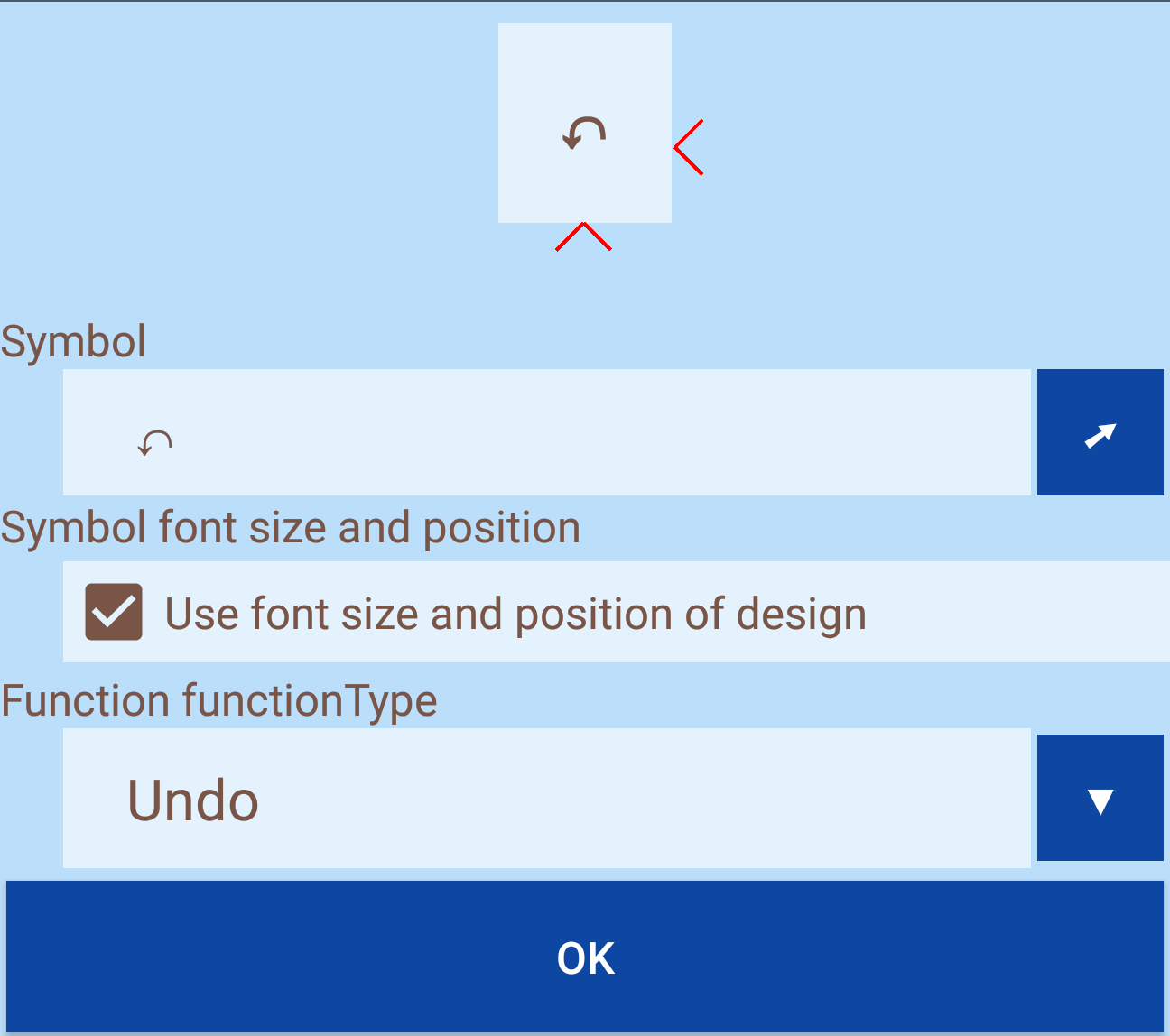
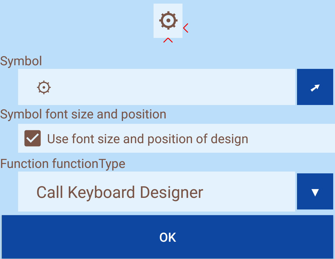
For each action, a symbol and a function can be assigned. If only one symbol and no function are assigned, the action remains without reaction. It is also possible to assign a function without a symbol (but this is only mentioned for the sake of completeness ...). The symbol can consist of several characters which can be selected with the character selection. The position of the icon on the button depends on the action: Press: Center, Hold: top right, Swipe up: top left, Swipe right: bottom right, Swipe down: bottom left, swipe left: left. The currently edited symbol is marked in the keyboard preview with two red hooks on the right and below the key. Depending on the characters, it may be necessary to change the font size or the position of the symbol to avoid overlapping. For this purpose, the tick must be removed so that the font size and position correspond to the design.
A description how to enter symbols and output can be found here
Text functions manipulate the text in the editor.
This is the most used feature. When executing an action, characters are passed to the input field. The characters can correspond to the symbol or even deviate from it. After removing the hook, up to three characters can be selected using the character selection.
The function offers the following options:
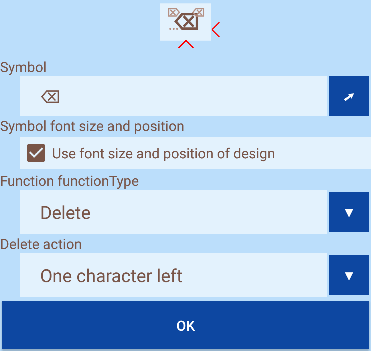
Delete a character on the left, delete a character on the right, delete a word on the left, delete a word on the right, delete to the beginning, delete until the end, delete everything.
This function copies all marked characters to the clipboard so that they can be pasted into the same or another field. By using "Cut" all marked characters are deleted after copying to the clipboard.
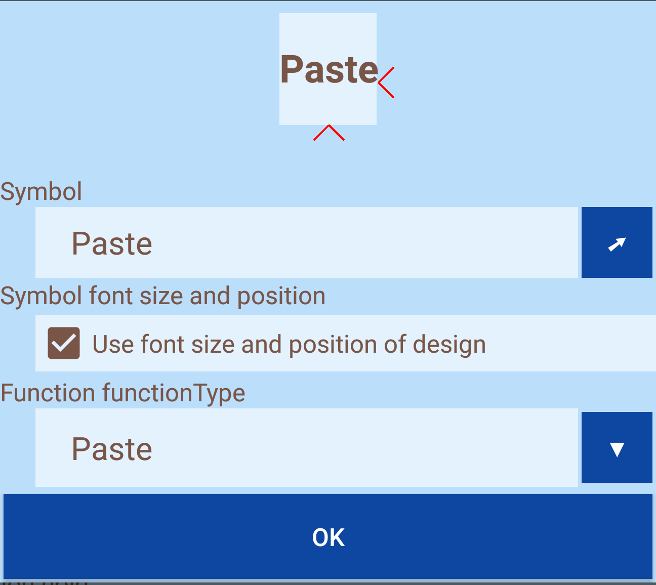
Insert the characters from the clipboard at the current cursor position. The clipboard can be filled either from the keyboard or from another app. This function does not change the clipboard and therefore the paste can be repeated as often as you like.
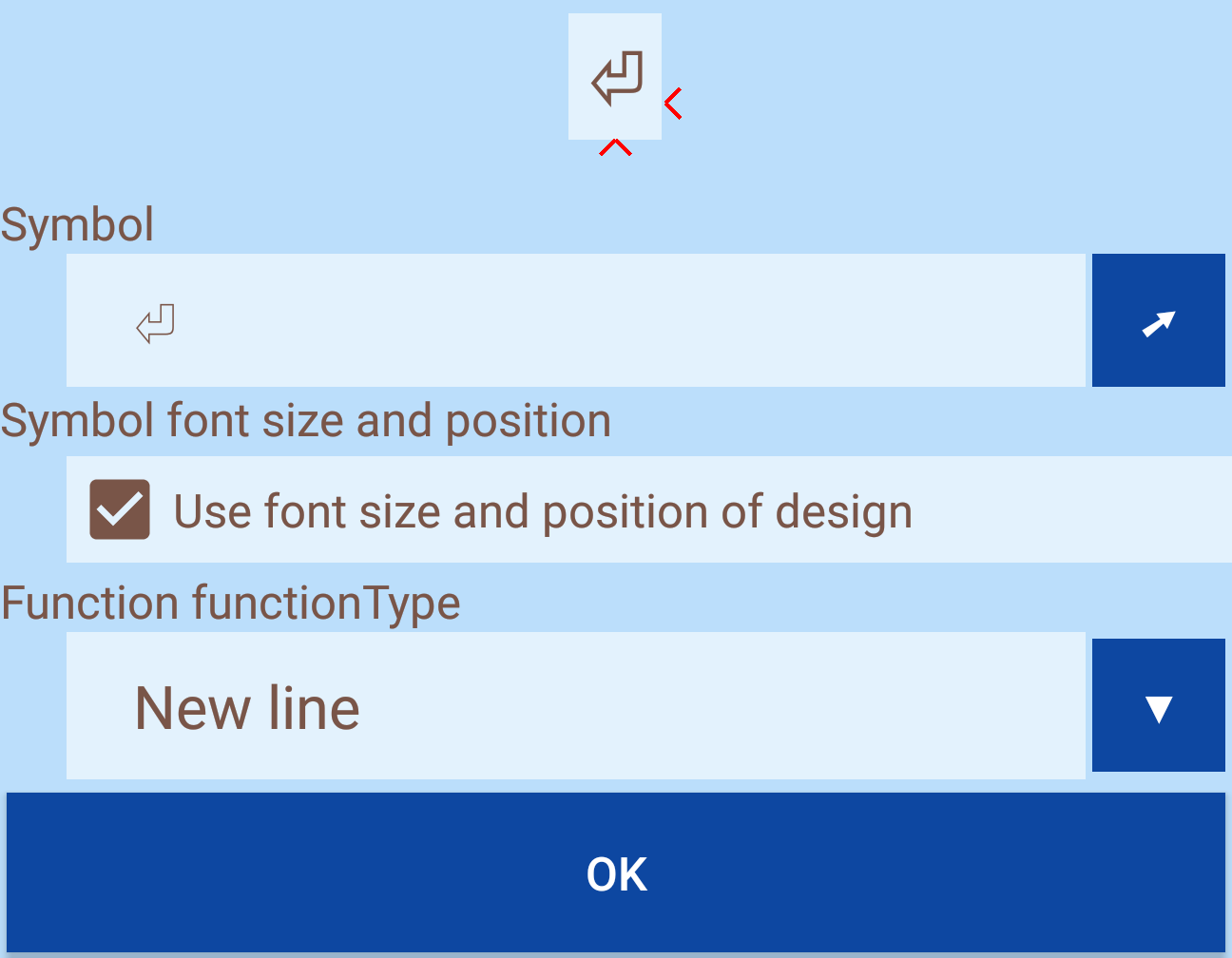
If the input field supports multiple lines, the current line can be ended and a new one created.
Functions for controls do not send characters to the editor but are used to edit the text.
The function offers the following options:
Character left, character right, word left, word right, all, nothing all or nothing
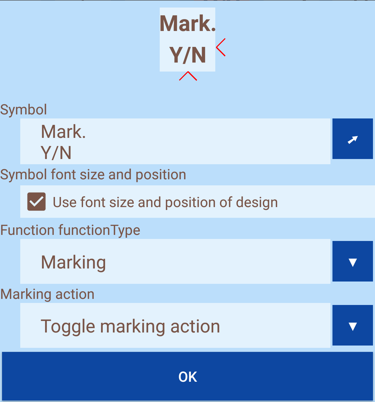
It is also possible to switch the marking mode on and off. It can be used to mark characters using the cursor keys. Marking characters is used to apply the same function to all these characters (eg delete or replace with a character).
The function offers the following options:
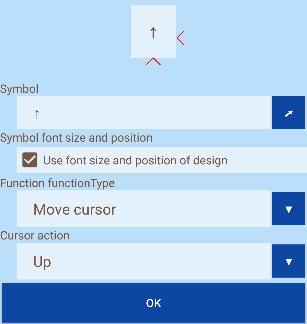
Up, right, down, left, to beginning of row, to end of row, next word, previous word, to beginning of text, to end of text
If the marker mode (see function "Mark") is activated, you can use the cursor keys to mark characters.
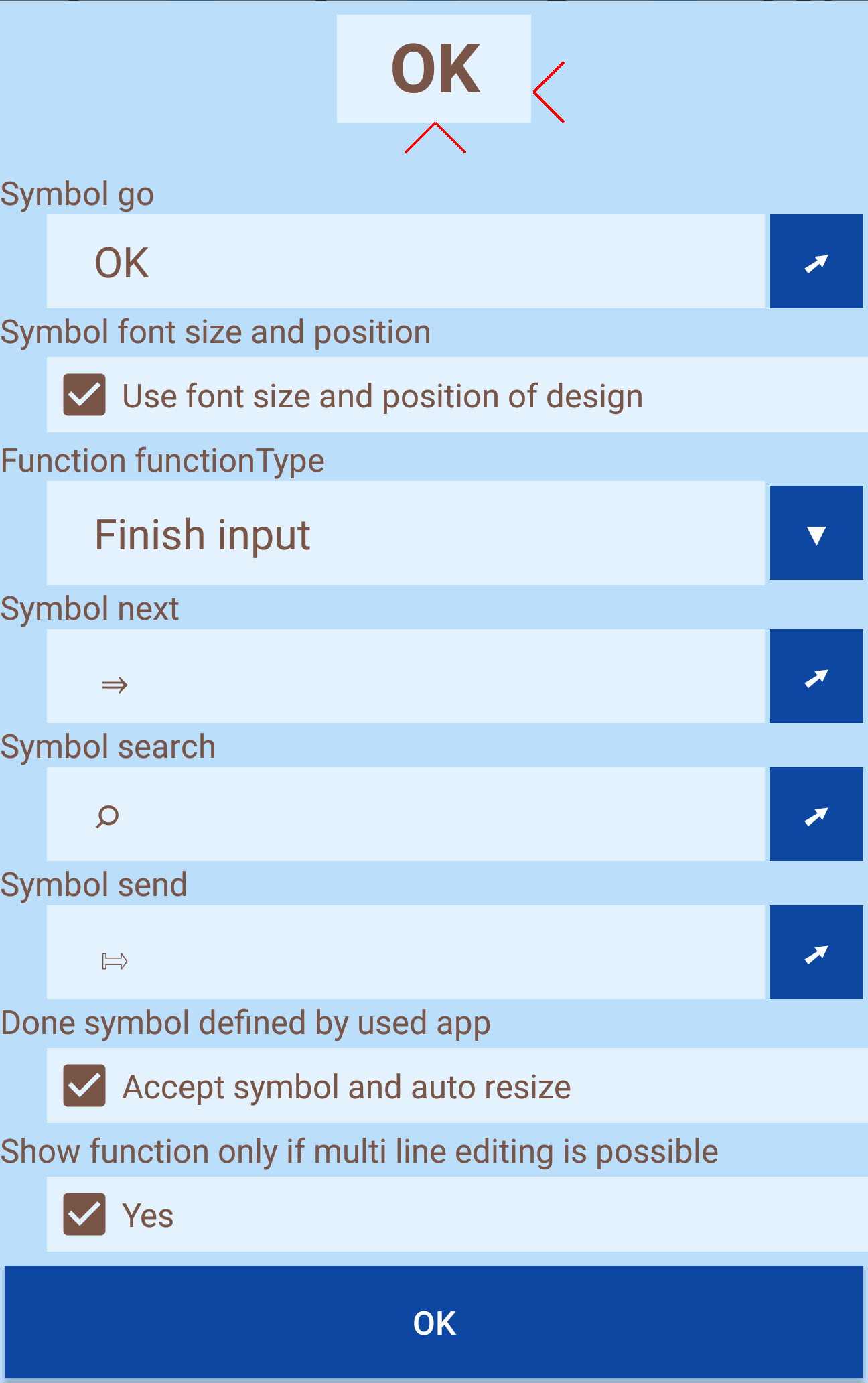
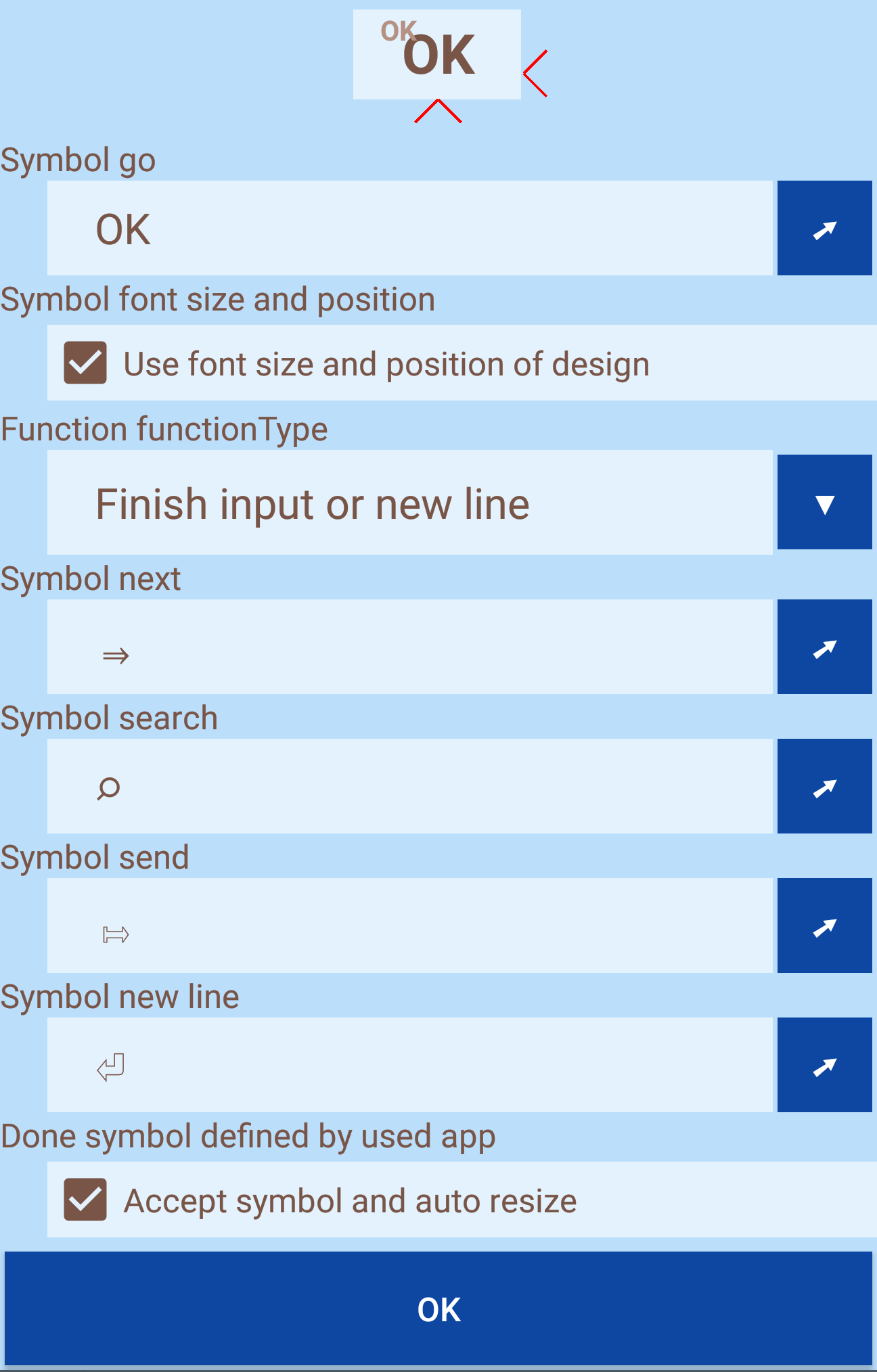
This function ends the input. For well-programmed apps, the input field provides information about what happens after you finish typing. For example, the field can be changed, a search can be started or the data can be sent. Different symbols can be defined for these options so that it is clear even before the input is completed which action is subsequently executed.
Apps can also provide text to clarify this. Keyboard Designer is one of the few keyboards to display this on request and adjust the size automatically - the corresponding hook must be set. Otherwise the standard symbol will be displayed.
This function executes a line break if several lines are permitted in the input field, otherwise the input is terminated.
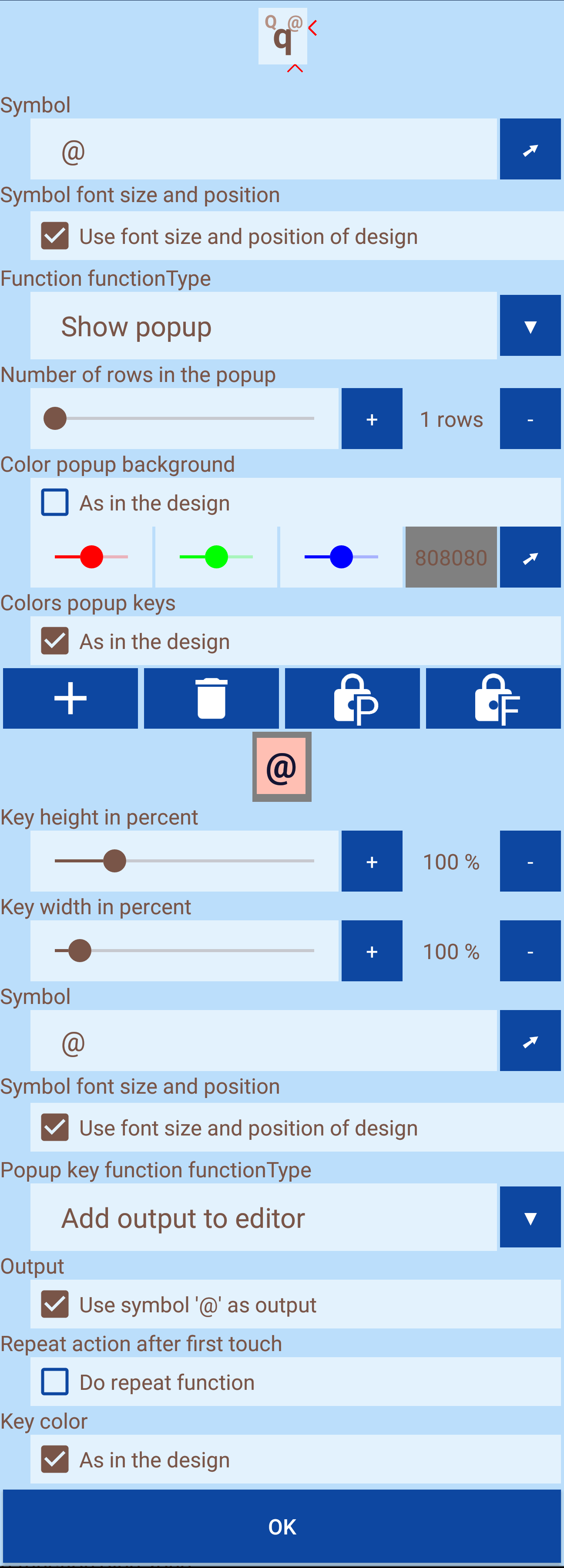
This function displays additional buttons, each of which can be assigned a function. For this purpose, the number of lines in the popup and, deviating from the design, colors can be set. A preview of the popup will be displayed directly. New buttons can be added via the plus button, existing ones can be deleted via the delete button. To edit a key, it must be selected. Selected keys are highlighted in red. In order to move keys or to replace their functions, they must be enabled via the corresponding buttons. The scrolling is blocked until editing is disabled again. Below the preview, a function can be assigned to each key. All functions of normal keys are available, except for the call of another popup.
The following function do not have an impact on the editor but on the keyboard itself.
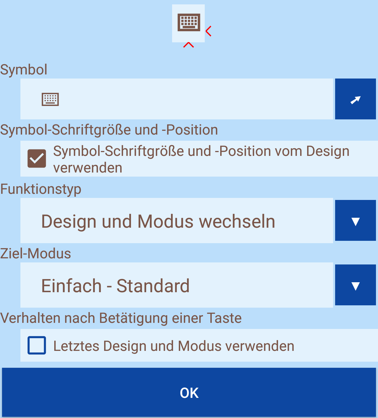
It is possible to specify the design and the mode whose buttons are to be displayed. You can also keep the design and only assign a different mode. If desired, you can also switch back to the previously used mode as soon as a function has been executed. For example, after entering a capital letter, you can automatically switch back to lowercase letters.
With this function, the designer can be displayed and changes made to the keyboard directly. As soon as the designer is left, the changes are there.